
For the third time, I ran the same 10k race in Athenry this year (St Stephen's day 2011) and as in previous years, the results are available online. For the second time I wore my GPS watch & heart-rate monitor and data captured by that device can be browsed and downloaded here. Kevin Doherty shot a video of the race. As for the previous events, I was again totally impressed at how well organised the whole thing was. I really enjoyed it, I felt great afterwards and the event is a credit to the town.
I forgot to stop the timer at the end, but my finishing time was about 45:44, which I am extremely happy with. I'd been injured since June, only running 25 min once a week (plus squash), I'm a little overweight and had thoroughly enjoyed all the christmas trimmings the day before. I had expected to come in at around 48 or 49 mins.
During the first couple of kilometers I was finding it hard to keep a constant pace, I kept tearing off after people overtaking me and having to stop myself. I knew that I wasn't in great shape and that I'd really struggle for the last half of the run if I went flat out from the start. So I picked out one of my fellow runners who looked like she knew what she was doing (Edel Tighe) and tried to just keep up. I chose well as it turned out, she kept going like a metronome for the whole race. It helped a lot to have a target to focus on, especially for the last 3km when I was really struggling.
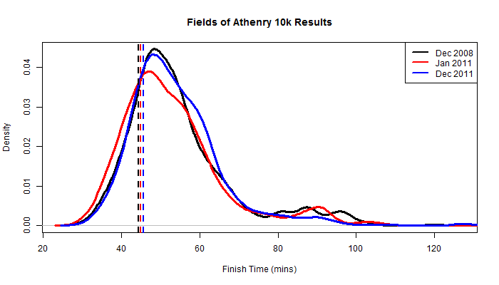
As I did last year, I have again tried to make my result look better by unleashing the power of statistics, again without much success. The race was very windy this year, and I wondered if this would have a significant effect on the finishing times. Median finishing time was indeed 1.03 mins slower in Dec 2011 than in Jan 2011 (p-value 0.049, Wilcoxon test). Interestingly this increased time to finish seems to be largely caused by men running slower, there is no significant difference between median women's finishing time in January and that in December. I can't think of a clear explanation for that.
Below is a plot summarising finishing time distributions (probability density estimate) for runners in all categories for the same race run at the end of 2008 and at the beginning and end of 2011. The small, right-hand peak seems to have diminished this year and the main peak fattened, which might indicate that people are training harder on average. Vertical dashed lines are my times in those races. The variability in my finishing times is reassuringly small compared to the population spread.
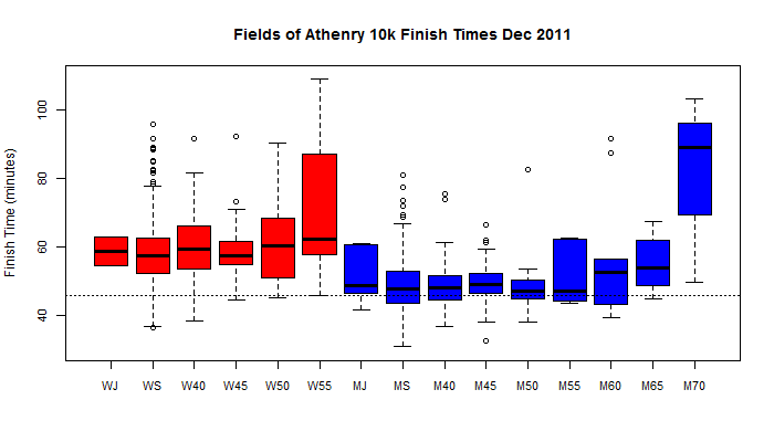
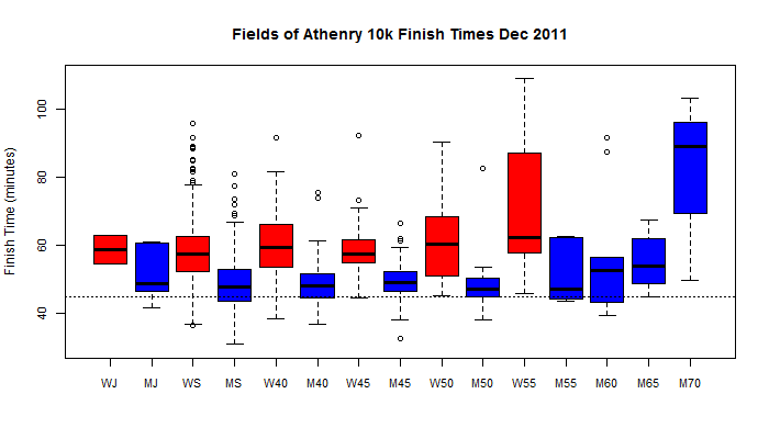
And below are two boxplots summarising finishing times by category (age and sex) for Dec 2011. The horizontal dashed line in each plot is my finishing time in that race.
The finish line...